A second chart, right beside the first
For a long time, comparing two tickers in the terminal meant loading one, squinting at it, loading the other, and trying to remember what the first one looked like. I've done that with NIFTY and the Dow more times than I'd like to admit.
So that's gone. You can now open a second chart beside the first.
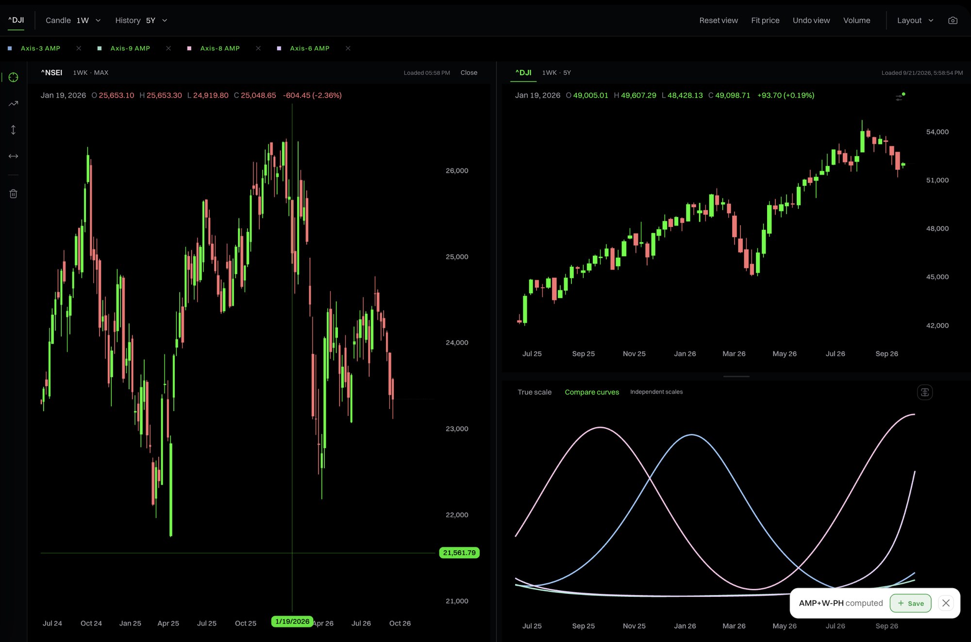
Two charts, side by side
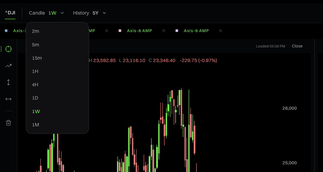
Hit Open beside from search, any watchlist row, or the quote card under the list. Each chart keeps its own candle size and history, so a weekly Dow can sit next to a daily NIFTY. The toolbar follows whichever chart you clicked last. Want them the other way round? Swap charts is in the Layout menu.
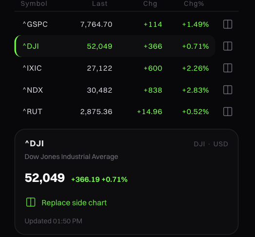
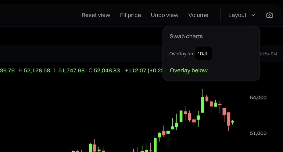
Overlays go where you want them
Your overlay can sit on either chart, above price or below it, and you can drag the divider to resize the pane. Hover anywhere and the same date lights up on both price charts and the overlay. Honestly, that linked hover is the bit I keep playing with.
The Save prompt used to float over the price chart and get left behind when you moved the overlay. It lives inside the overlay now and travels with it.
Compare curves
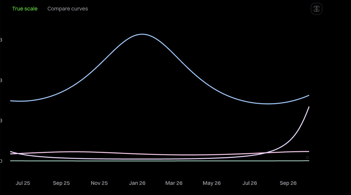
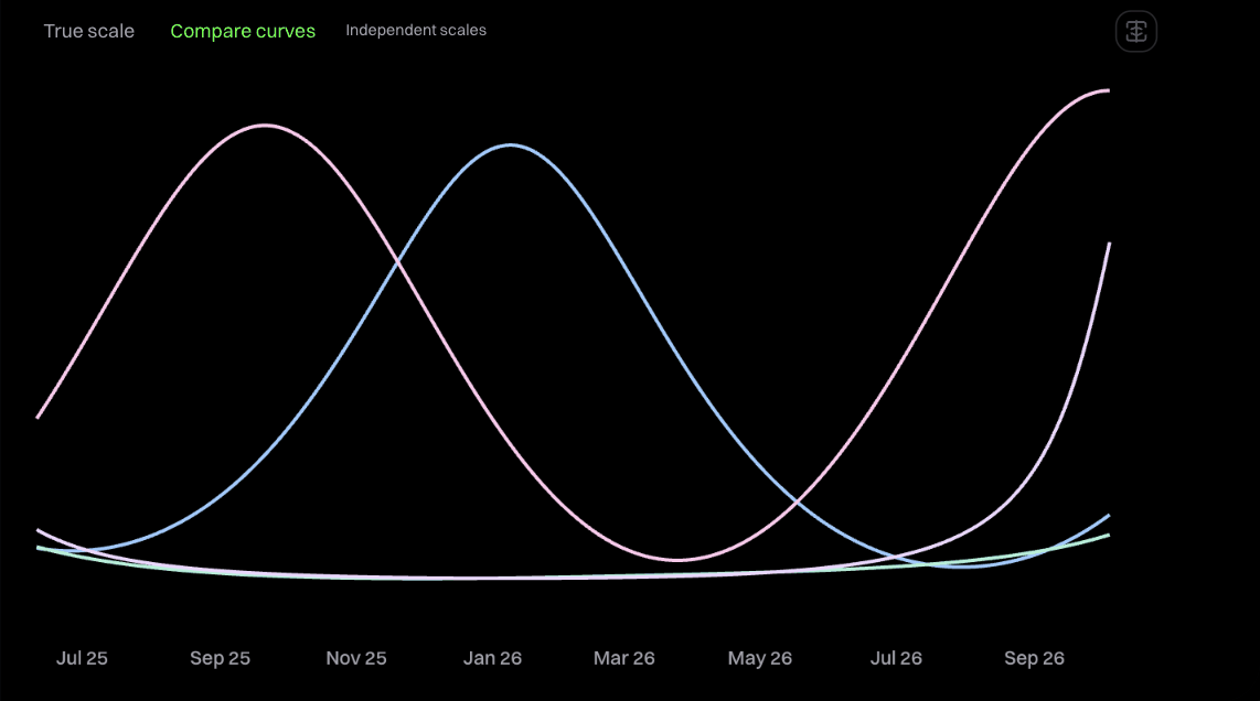
If you've plotted a few amplitude curves together, you've seen it. One of them is huge and the rest flatten into a line along the bottom. True scale is still the default. Compare curves gives every series its own vertical scale, so you can read the shapes against each other. Hover values and anything you save stay in the original units.
A drawing rail and a calmer toolbar
Cursor, Trend, Price, Date and Clear drawings moved to a rail on the left edge of the chart. Candle, History and Layout are compact menus now. Reset view, Fit price, Undo view and Volume stay visible up top, because those are the ones you reach for when a zoom goes wrong.
Fixed: 1M candles on Max history
This one was embarrassing. On monthly candles with Max history the chart wouldn't pan or zoom sideways at all. A spacing limit that was meant to protect the view had turned into a trap you couldn't drag out of. It pans and scales now.
Smaller things
- Quieter axes, date labels that adapt as you zoom, and a neutral crosshair readout.
- Clearer messages while data loads, a retry when it fails, and a note when your overlay sits outside the dates on screen.
- Filled labels, stray text and spacing cleaned up. Tickers line up.
- Every control targets the chart you've selected, so changing the Dow never touches NIFTY.